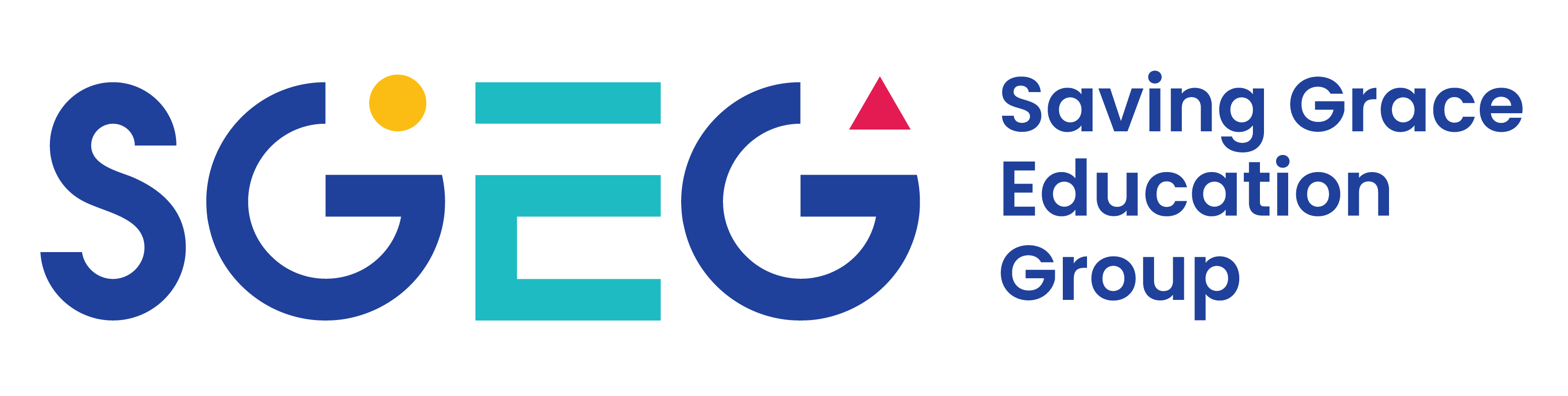
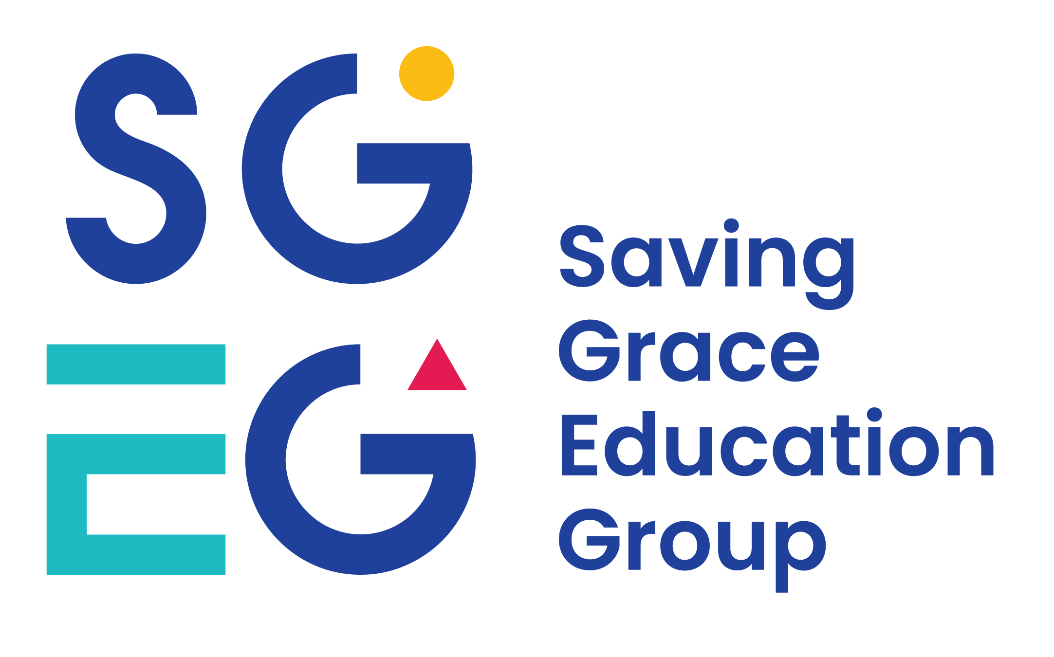
01 · The brand logo
The heart, soul, and centre of the brand identity.
Our logo is how customers tell us apart from a crowded industry. It is a promise of quality, consistency, and reliability — and it must be presented correctly in every execution.
Primary lockup · Landscape
Primary lockup · Portrait
Lettermark
SGEG mark
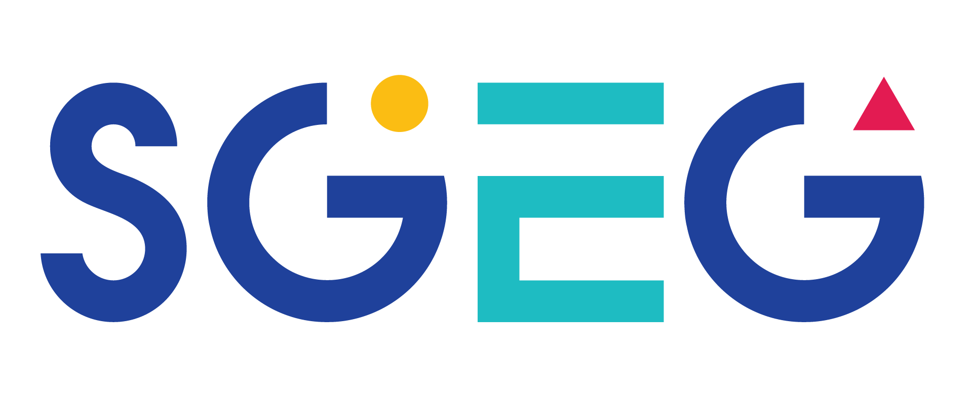
Standalone lettermark for use where the wordmark is not required — favicons, app icons, badges, social avatars.
Clear space
Breathing room
At a minimum, clear space equal to the height of the SGEG lettermark on all four sides. The more, the better.
SGEG
≥ 1× lettermark height
Placement
Anchor to the spine
The logo is left-aligned to the primary grid line. Never centred. Exceptions confirmed with the design team.
SGEG
Left-align
to spine
to spine
Colour variations
Use the most legible variant for the available background
For printed executions, give special care to logo legibility on the final media. When in doubt, default to the highest-contrast option.
On white
On light grey
On navy · reversed
On image · reversed