01
Phase · Diagnose
Foundations · Identity
The marque, the lockup, the wordmark.
One identity, three forms. The full lockup leads. The marque stands alone where space is tight. The wordmark carries text-only contexts. Give it room: hold clear space equal to the height of the marque on every side, and never recolour it outside ink, white, or the assets here.
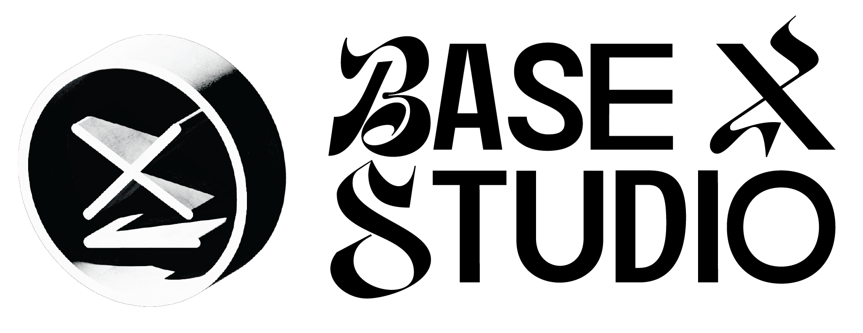 Primary lockup · on light
 Reversed lockup · on warm-dark
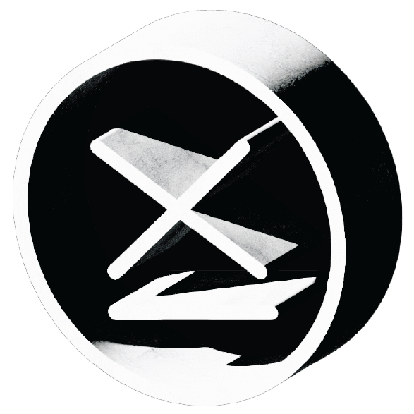 The marque
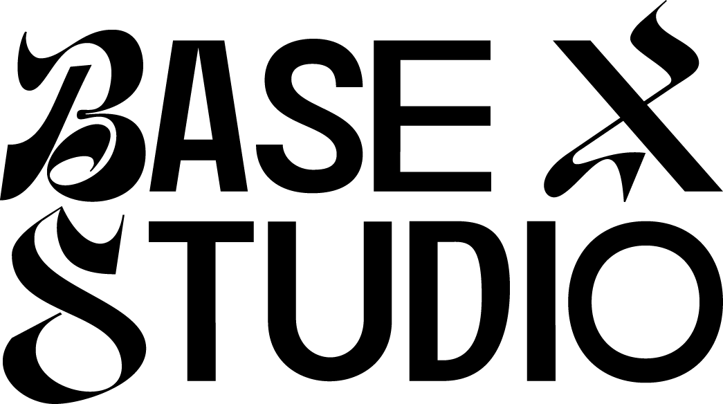 Wordmark · black
 Wordmark · reversed