How the brand looks, on every surface. The shield, the palette, the type, the textures. Cream-forward, navy-grounded, copper for emphasis. Every visual decision pre-answered, in one system.
The HOSI lockup pairs the HT shield with the wordmark. The H and T letterforms interlock inside a shield silhouette: security and stability, carried without being literal. The shield carries the brand at its smallest; the full lockup leads wherever there is room.


The full-colour lockup is the preferred application. Use it whenever there is space to breathe.
Full-colour on cream and white. White lockup on navy. Navy lockup on copper.
Never recreate the lockup. Always use the supplied artwork.
Clear space is the minimum protected area around the mark. Nothing enters this zone: not text, not image, not the edge of the page, not a competing element.
Print: full lockup never below 32 mm wide. Digital: never below 190 px. Shield only: 16 mm / 40 px.
On cream or white use the full-colour lockup. On navy use the white lockup. On copper use the navy lockup. On photography, place over a calm, low-contrast area.
Consistency is what builds trust, and trust is the product. Do not stretch, recolour, rotate, decorate, or otherwise reinterpret the mark.
Navy holds the structure. Cream is the canvas. Copper is the single charge, and the copper gradient is the one emphasis device, reserved for the phrases that need to land. Anchored on the official HOSI CMS colours.
Four surfaces, each with a role. Cream recedes and lets content lead. Navy earns weight and focus, the SOC and the security moments. Sand warms the storefront. The copper gradient brings energy to feature moments.
The material language layered on the surfaces. Each texture signals something: structure, energy, focus, depth. Use one at a time and let it earn its place.

A copper line system built from the shield. Even strokes, rounded joins, one weight. The shield is the brand at its smallest; the service set carries the pillars.

 Cybersecurity
 Data Intelligence
 Enterprise AI
 DevOps & QA
 ITSM
ITSM HOSI Academy
HOSI speaks from experience competitors cannot manufacture. Authoritative without arrogance, plain about complex things, African in confidence and global in standard. It names the risk plainly and lets the substance do the lifting.
Sixteen years, four ISOs, four countries. The voice carries the weight without performing it.
Explains cyber, AI and compliance in language a CFO can use in a board meeting. Jargon only when it is precise.
African in confidence, global in standard. No defensiveness, no overclaim. The substance is the proof.
Real risk to real organisations, said plainly. No euphemism, no fear-marketing, no superlatives the substance does not earn.
Real people, real environments, a cool navy grade warmed by copper. Business at scale, the SOC at work, the continent as a secured network. Prompt-ready briefs below: generate, then drop the result into the placeholder.
Analysts at a 24/7 Security Operations Centre, glowing dashboards, low ambient light warmed by copper screens, candid focus. Navy grade, shallow depth of field. 3:2 ratio.
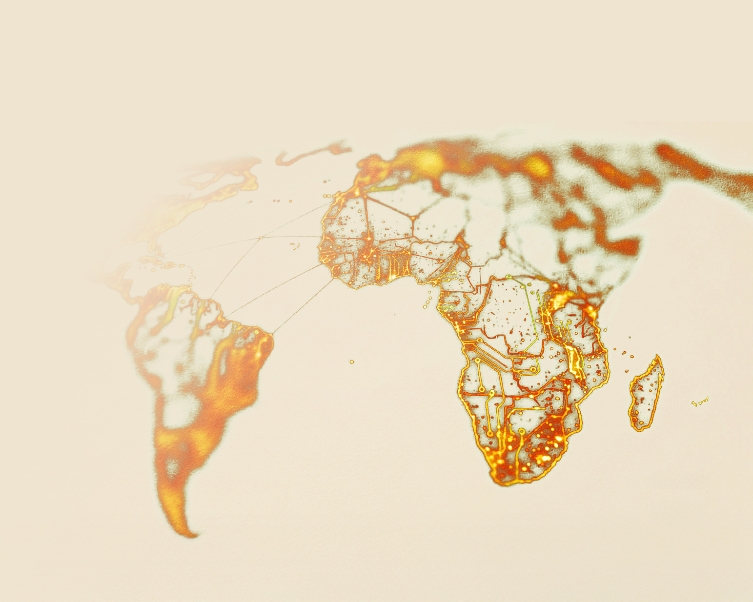
Africa rendered as a connected circuit-board network, copper data paths lit against deep navy, nodes pulsing at the four office cities. Premium, dimensional. 16:9 ratio.
Nicol Mkhacana, confident and composed, considered light, navy backdrop, copper rim light. Editorial, honest, never staged. 4:5 ratio.
A single glass-and-chrome HT shield floating on a deep navy gradient, studio lighting, soft copper caustics, shallow depth of field. Weighted and modern. 1:1 ratio.

One identity across every surface. Website, decks, social and out-of-home all use the same lockup, the same colour logic, the same voice. Only the format changes.